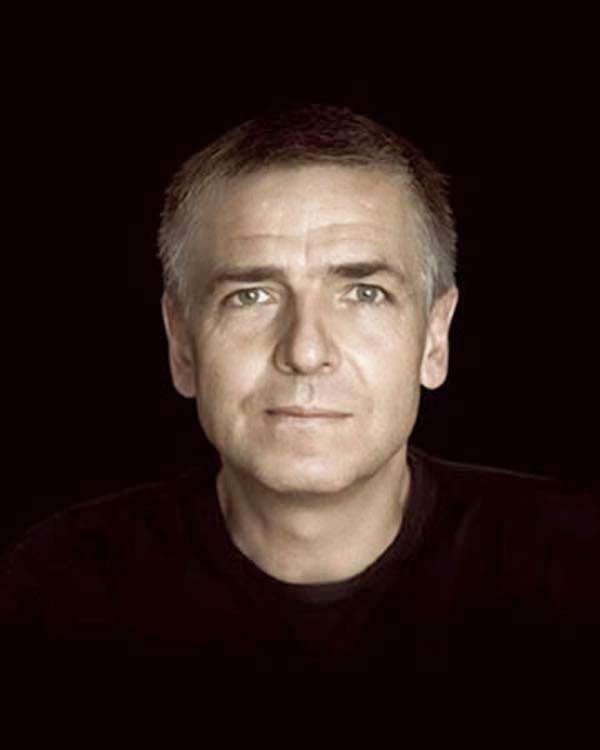
Monday 2 June 2014

Evaluation


ISO - 100
Shutter Speed - 1/250
F Stop 2.8
White Balance - Auto

My original idea was to shoot in a studio with a white wall behind me. I also wanted to hold up a card saying the words 'Right Now'. I wanted to use the studio to take my photo but as that wasn't available i had to change my idea. Instead, i had changed my location and I went to Sackville Gardens to take my photograph. Once i had finished my photo-shoot, i uploaded the photos onto iPhoto. I was meant to drag the photos onto the desktop. Instead i instantly dragged my photos onto iphoto which cropped my image. And reduced it's size. In doing so, my original file disappeared. And the actual file size wasn't the right so when I zoomed into the image, the image would then pixelate.  I had used photoshop to edit the video and changed the colour on the picture. I was happy with my black and white copy i had made from the picture. But I wanted to experiment with the colours so I played about with the contrast and the colours available to me. So I created a picture and changed all the settings and it turned out like this


At first, I found it complicated to use the canon camera. Simply because I had never used a Canon before. Although we did have a workshop where we used Canon cameras to get the hang of it prior to the actual photoshoot. So I wasn't very familiar with the setting sides of things such as the ISO settings etc. But as the photoshoot neared I took a few practice pictures to get familiar with the camera. Although at this point, my knowledge with this camera wasn't great, I was gaining confidence in using it.

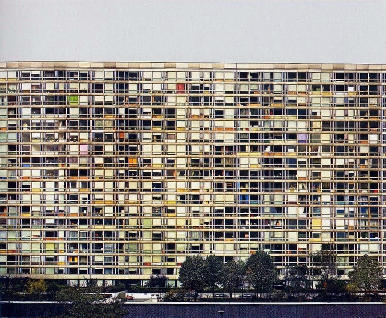
I wanted a pop feeling to this cover. So by bringing out the colours on the surroundings, I thought it may have bought the emotions out necessary for it to be a pop album cover. I wanted writing on the album cover, so i thought id use the name of one of my favourite albums of all time, 'Right Now' which was a pop album. I had looked at countless pop albums prior to the photoshoot and there wasn't really one similar to mine. However, there was references to mine so I took all those references and decided, I wanted my picture like that.


I believe my photo turned out how I intended it too. Simply because I did not regret anything after i took the photo, I was extremely happy with what I produced. I wanted to make my album cover a little emotional, and by taking a picture of a male standing with colourful beautiful trees behind him can convey that emotion I believe.

Overall, this project turned out how I expected. Trials and tribulations here and there, however, I got there in the end. I expected this because, this was my first time using a Canon camera, and it was my first major photography project. I had a vision of what I wanted my work to be like, and as the process went on, I stuck with that vision throughout when I easily could have changed it, I didn't and I got what I wanted at the end. So this is why, this project was a success for me.


Thursday 13 March 2014

Rational, Purpose and Technical Information Of My Photos.

 In this photo, theme is heavy. i thought about the idea of a tyre being heavy. If i'm honest, this photo hasn't really got much to it's idea. However, this was because of the locations we were taking the pictures at.

 In this photo, the theme is based on space. The shadows signify society, and the shadows you see on the image are spaced apart, i wanrted to show the space in society between people and how broken our society is. I think the shadows apart do show this.

 This photo i believe was where i had to think hardest of what to portray. It is the theme of time. What i wanted to show is that how the filth in the hole is a representation of the world we live in today. The filth signifies all the bad things in our world, the wars that go on, Dictator's, terrorist etc. And the hole, is the world. And that the bad things that i've mentioned above, is leaving a hole in our world. The visuals are quite clear, filth around the sewage. People may not interpret the photo like i have done as people may have their own own interpretations of the photo.

 This photo represents time. It is a picture of a charity vault. I did this because, i believe it is time to give back to the people less fortunate than we are. Also, the thank you written on the vault has a powerful message in itself. I believe the message has been put out well. Because when we or someone else receives something we are truly grateful for, the best thing is to say thank you. And the thank you written on this vault says to us that the people in poverty will be extremely grateful for anything that we give them, whether its food, clothes, footwear or even the smallest thing.


In this photo, the theme was glass. I took a picture of parts of a person through a glass and also their whole face too. I wanted to show that, when we question things in life, sometimes we question it superficially. Also sometimes, people are quick to judge other people without knowing the real person. I wanted to show someone looking through the glass, because people need to see things from the other persons point of view, rather then their own.

This photo is based on the time theme. I took a picture of a someone looking at a calendar. The calendar represents a time or place or an event. The reflection of a face is also shown in the image. 


In this photo, the theme was heavy. I took a picture of brown heavy looking oversized vase. Again, because of the location there was not much meaning behind this photo as there are not any heavy object around there.

This picture's theme is glass. I wanted the broken glass to portray a human, when a person feels broken inside. The space around the glass is very big compared to the glass. I wanted to space to portray a humans mind too, how it's all empty when a person is broken, which links with the broken glass. I think the message could have been more clearer had there been more shards or broken glass around the one you see in the picture.

Thursday 27 February 2014

I changed the brightness in this, as well as the contrast. To the point it looks like i'm holding a torch underneath my face. I also wanted the dark background just behind me to make my face look brighter


Monday 4 November 2013

4 Photographers

He is known for his photographic projects that take an personal look at aspects of modern life, specially documenting the social classes of England, and more heavily the wealth of the Western world. Martin started off as photographer who would take his photos in black and white but he then changed into colour. Martin has published 50 books, and has featured in 80 exhibitions worldwide. Martin used to enter people’s homes and used to take picture of the home owners going about their daily lives. He then used to combine the images with quotes and then show it to people and the photos used to make people unsure about their feelings.


http://media4.picsearch.com/is?JFNipt8QoXyQccjE5aCKlmLM7uSx3qCswUcj4MRHMr0&height=204http://media4.picsearch.com/is?JFNipt8QoXyQccjE5aCKlmLM7uSx3qCswUcj4MRHMr0&height=204http://media4.picsearch.com/is?JFNipt8QoXyQccjE5aCKlmLM7uSx3qCswUcj4MRHMr0&height=204http://media4.picsearch.com/is?JFNipt8QoXyQccjE5aCKlmLM7uSx3qCswUcj4MRHMr0&height=204


Andreas Gursky is a German photographer artist known for his large format architecture and landscape colour photographs. Andreas never used to digitally operate his images before the 1990’s. Ever since, AndrĂ©a’s has been frank about using computers to work on his photos. Andrea’s photos are very straight forward, but also very puzzling and blank.
The view in many of Gursky’s photographs is drawn from an elevated vantage point. This position allows the viewer to encounter scenes, encompassing both centre and the outer limits, which are physically beyond reach. Before the 1990s, Gursky did not digitally manipulate his images. In the years gone, Gursky was never keen on computers to edit and enhance his pictures.


Mario Testino ) is a fashion photographer. His work has been included in magazines such as Vogue and Vanity Fair. Mario has worked with many famous people in his career, such as Kylie Minogue, Lady Gaga, the Princess Of Wales. He has contributed to the imaging of leading fashion brands such as Gucci, Calvin Klein. In 2011, Testino was given an ‘Honorary Fellowship’ by The Royal Photographic Society, due to his work in fashion photography. Testino has become one of the world's most well known fashion photographers. His work has been shown across the world in magazines such as Vogue, Vanity Fair and V, and he has contributed to the works of leading fashion brands such as Burberry, Gucci, Versace, Calvin Klein, Dolce & Gabbana and lots more. As well as having published seven books of his work and edited one other in tribute to contemporary art and artists from his country Peru, he has had many successful exhibitions in galleries and museums around the world.


http://media4.picsearch.com/is?JFNipt8QoXyQccjE5aCKlmLM7uSx3qCswUcj4MRHMr0&height=204http://media4.picsearch.com/is?JFNipt8QoXyQccjE5aCKlmLM7uSx3qCswUcj4MRHMr0&height=204
Simon Roberts is a British photographer whose work has been displayed and published globally. Between July 2004 and August 2005 Roberts travelled throughout Russia, taking photos in 65 destinations which lead to in the book and exhibition Motherland.

Between August 2007 and September 2008 Roberts travelled throughout England in a motor home using a large format camera taking people at play, and discovering the connection between people and the places they visit. This resulted in the book and exhibition We English.

For his work, Roberts has received several awards. In 2007 he was awarded the Royal Photographic Society's Vic Odden Award- offered for a notable achievement in the art of photography by a British photographer.  In 2013 Roberts received an Honorary Fellowship from the Royal Photographic Society which is given 'to distinguished persons having, from their position or attainments, an personal connection with the science or fine art of photography or the application thereof'. (Wikipedia)


White Balance and Focal Length


White Balance

White Balance is a setting on a SLR camera that helps to change the lighting to help so that white objects appear white in the photograph. Sometimes this is difficult to do because the light cast from different light sources is different colours. This is called colour temperature; an eye is very good at judging what is white beneath different light sources in contrast to an SLR camera, which has difficulty picking it up as auto white balance. For example, it can create a blue and orange colour cast. White balance helps you prevent picking up these colours when taking a photo and it also helps you take a better picture under different light conditions.


Focal Length

Focal Length is the distance light rays that come together to make the image sharp of an object to the digital sensor. Focal Length tells us the angle of the sight, like how much the camera has increased and how much the camera frame has captured. The more the focal length the narrow the view of the angle will be and the magnification will be greater. So the opposite will be the shorter the focal length the longer the angle and the magnification will be smaller.

Different Lenses


This is a Standard Lens, which goes up 35mm. Used for general photos.
A standard lens is a lens that gives out a field of view that generally looks "natural" to human eye under normal viewing conditions, as compared with lenses with longer or shorter focal lengths which produce an larger field of view that affects the perspective when viewed from a normal viewing distance.


This is a Micro lens. Best used for close up shots. It can capture every fine detail in a picture. The highest it can go upto is 105mm. It is used for modelling and also used for dramatic captures.


This lens is a Telephoto lens. These lenses have very high magnification, which can go upto 300mm.
These lenses are used in sports events such as football, cricket etc. This lens is best used for capturing wild life moments.


This image was shot in auto white balance. When the camera’s white balance is on this setting gives the image a standard and natural look to the photo.


This image was shot in tungsten white balance.

When the camera is on the setting of tungsten, it gives the image a blue-darkish affect, when this setting is used outside it will give the opposite colour effect.


The image was taken in cloudy white balance.
You can also fix your white balance to cloudy white balance. You can also set your white balance, which is used, for gloomy settings to shoot in.